Maps have long been a staple of election reporting. The US Presidential election, for instance, is one of the most mapped anywhere. Be it the presidential election or the midterms, maps help voters everywhere to digest and understand results. Typically, results are reported from precinct to county, to state, and then nationally. Use of more granular maps produces data that better visualises local politics.
When Kenya won its independence in 1963, the country was divided into eight provinces (or seven provinces and Nairobi Area). Those administrative divisions did not precisely map onto the 42 ethnic groups Kenya was known to have (this number has since increased to 44 after Kenyan Asians were recognised). So, for example, Charles Hornsby’s history of Kenyan politics refers to “Lower Eastern”, “Luo Nyanza ” and “the Kalenjn Rift ” to identify parts of these provinces dominated by certain ethnic groups more clearly.
Digital mapping was still in its infancy at this time. Accounts on how Geographic Information Systems came to be all credit Roger Tomlinson, a Canadian, for creating the first computerised GIS in the early 1960s, when independent Kenya was in its infancy.
The promulgation of the Constitution of Kenya in 2010 created 47 new local governments, each with a name that evoked local history and traditions, as opposed to the previous colonial units that were based purely on physical features (Nyanza, Coast, Rift Valley) or orientation from the centre (Eastern, North Eastern, Western, Central).
Then the rise of Google Maps and Google Street View put maps at everyone’s fingertips.
Suddenly, everyone wanted to map things and use maps to tell stories and see places we could not reach physically. This was how we could confirm, for example, that deep in the Mau Forest, people were felling trees even if the edges of the forest remained untouched. Through satellites like Landsat, we could now track changes in the land over time. High-resolution satellite images are used to track aircraft and ships and to hold perpetrators accountable for massacres across the world.
However, Kenya’s 2022 general election laid bare the limitations of our mapping in its current state, focused primarily on the county map of Kenya. First of all, county maps were useful for tracking only the presidential election yet votes were also held the same day for governors, senators, MPs and women representatives in the national assembly, and members of county assemblies. Sub-counties (which broadly match constituencies), wards and polling centres needed to have proper visibility and accountability in those subnational races, but were not mapped for the public during the election.
This limitation may have led to a ratcheting up of tensions during the counting process. Finer-grained maps would have made it easier to indicate that a candidate was leading in a certain polling centre, ward or constituency while making it clear that the overall county result was still far away. Instead, what we got was a tug-of-war on the map, where entire counties seemed to change hands between Azimio and Kenya Kwanza from hour to hour.
Interpretations were disputed. For instance Azimio supporters used the maps showing Odinga in the lead across a larger land area to bolster the argument that he was ahead. One Twitter user pointed out helpfully that population density was a better indicator of voter numbers than land area, while another cautioned that the blue-yellow shading was misleading where the vote had been close.
For the Independent Electoral and Boundaries Commission (IEBC) and everyone else producing these maps, including media and political parties, using lighter or faded colours to show a race in progress and then solid colour for final results would have reduced tensions and given IEBC the space it needed to do its work.
Maps of counties or other large administrative divisions such as states work well in a declarative sense, particularly for news organisations interested in the elaborate publication of a final result but they simply are not detailed enough to track a vote count in progress.
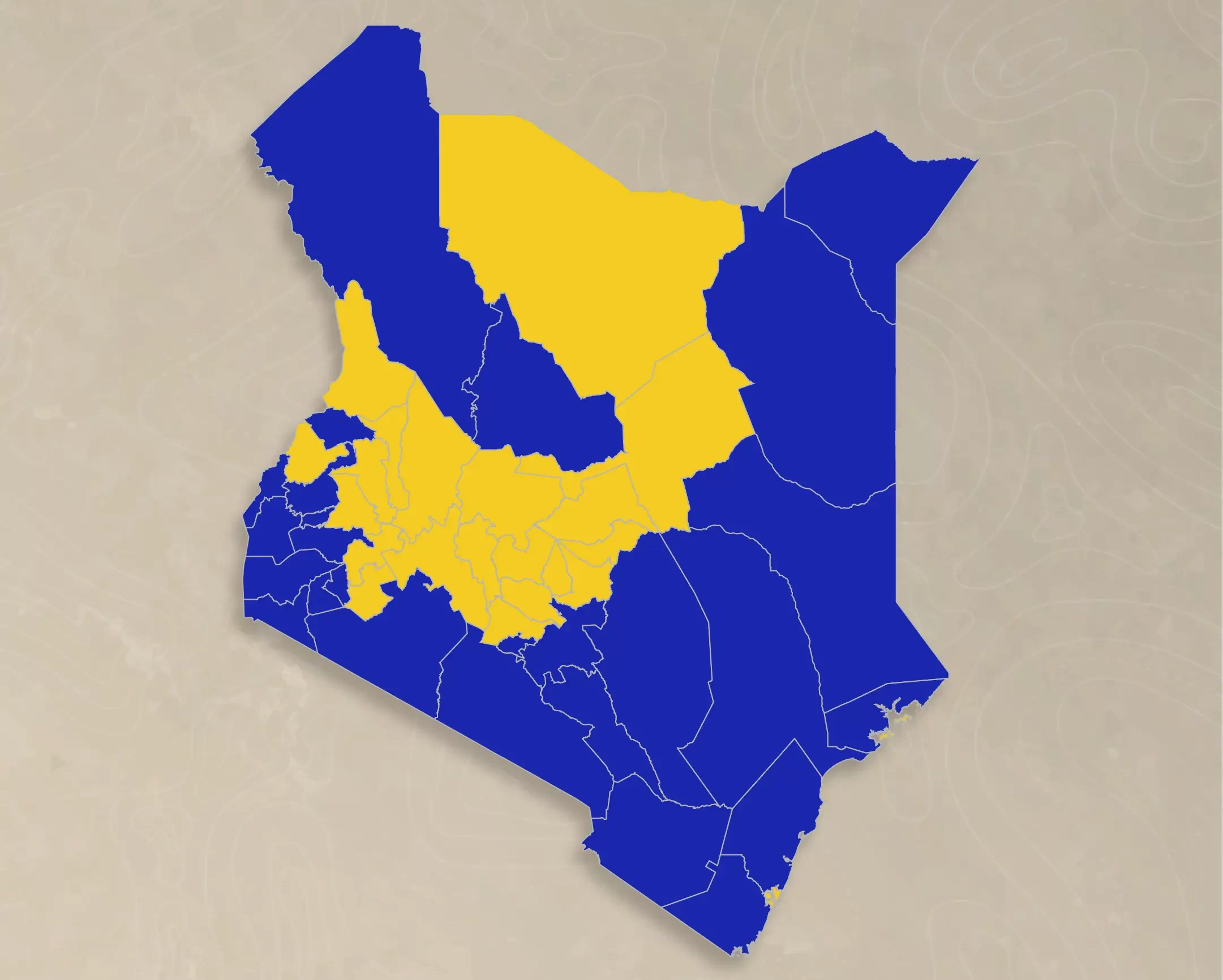
The good news is that we can expect 2027 to be very different on this score. Commonly available visualisation tools such as Datawrapper now provide maps of Kenya at sub-county level. The maps below show the difference that a sub-county map would have made during the 2022 presidential election.
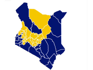
County map used during the 2022 elections obtained from Twitter (left) and sub-county map obtained from Datawrapper (right) with arbitrary shading for illustrative purposes. Light shading shows a lead, while darker colours show a concluded race.
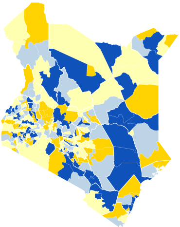
However, constituencies or sub-counties are not the smallest electoral unit. Wards can also be displayed using polygon or shape data, unlike polling centres, which would likely be represented using dots on a map, or point data.
A number of agencies use maps of Kenya at the ward level. These include humanitarian organisations such as the United Nations Office for the Coordination of Humanitarian Affairs (OCHA).
According to a foundational needs assessment report that was produced by the Council of Governors in 2017, the IEBC works with counties and even sells data to them. This means the election body is in an excellent position to disseminate maps of the country down to the ward level. The Kenya National Bureau of Statistics, which has data down to the sub-location is also well placed to help. In 2027, we should look forward to election maps that drill down to the sub-county and below. Hopefully, our conversations will be more data-driven and our vote counting much less tense.

